I support any browser, and so should you!
When working on websites, I try upholding certain standards. Some of which admittedly are somewhat silly (such as my decision to use XHTML), and some of which are borne out of genuine conviction.
Among the latter is that my websites should work regardless of device or browser, and especially that they are not designed with a specific one in mind, let alone require its use to function properly. I write standards-compliant websites without any shoddy design hacks or workarounds, using HTML elements like they were semantically intended to be used.
I support the AnyBrowser campaign that advocates this ideal as well. At the end of the page, I have added some AnyBrowser buttons, badges and banners I made for you to use if you so please. This following one is by Steve from the AnyBrowser campaign gallery, though:

So what's the issue?
If you are new to this side of the internet or webmastery as a whole, the idea of websites that might not display on some browsers but do work on others might come as a surprise; or perhaps you are already familiar with browser-specific issues on some websites or design elements working on one device but not on another. Maybe your own website works with Firefox but not with Safari. Rarely, you can chalk this up to an unintended bug in the browser or a simple oversight on your behalf, but the historical rabbit hole goes way deeper than just that.
For those who are not in the know what a contentious topic it used to be especially in the past, let me give you a history lesson on the web and the Browser Wars.
Ye Olde Days: The Browser Wars
The language we write our websites in is something called a markup language, essentially a machine-readable standard for adding additional information to existing text. For example, for telling the browser what portion of this page is a headline and what is a paragraph, what is a link and where it leads, whether something is a table and how many table rows and columns it has, and much much more beyond that. If you are curious what that looks like, feel free to use your browser to look at the source code of this post (usually by right-clicking and selecting Show Source or similar in the right click menu).
The markup language that dominates the World Wide Web today is HTML. HTML has gone through various incarnations; the web at large is now using HTML5. Over time, the HTML standard continually changes and always has done so: new possible elements to put on your website were and still are added, old ones removed or deprecated, and some technical details iterated upon with each version.
The HTML standard dictates what your website (which is, essentially, just a text document in a certain format) can and can not contain and which grammar you use to write that information down so the computer can read it.
For example, a paragraph like this must sit inside the element "p", an image is defined by an element "img", and headlines of various levels are conveyed by using the tags "h1", "h2", "h3" and so on all the way down. Your web browser reads you opening and closing the element brackets for "h1", and therefore deduces that the text inbetween those brackets must be a first-level headline.
That's all nice and dandy as it is! And in theory, every webmaster adheres to these rules on how a website is built, and every web browser is well programmed and follows the rules as well to successfully interpret and display a correctly written website without any issues. Because they have a common basis that agrees on what's what: the official HTML standard.
And that is how it was and the world was a place of happiness and love, for a pretty short time.
But in practice, we live in a capitalist economy, meaning that how we as a society produce is directly controlled by the whims and personal desires of individual business owners making their own silly little decisions with our collective workforce.
Because they don't just have a software company for shits and giggles, their only objective desire in such a massive game of Monopoly is to make as much money as possible for themselves. They arrive at their decisions based on what is most profitable to them personally, because why wouldn't they, who would say no to more money if they had the choice? And when several browser companies start programming and publishing browsers, such as Netscape Communicator, Microsoft Internet Explorer or Apple's Safari, they end up competing with each other over the market share to attract the most customers or users, and are pressured to do so at risk of going under otherwise.
But if all web browsers essentially only have to do the same thing, display websites correctly based on The Rules We All Agree On, how can they set themselves apart from each other to be more attractive to customers than the competitors? In the world of cars, vehicle manufacturers might compete for comfort, or speed, or security. But a good browser is a just a program that follows the HTML standards to display websites downloaded from the web, and not much more. And that is pretty easy to achieve for anyone by itself, also including non-profit free software communities and even individual hobbyists.
So, to set themselves apart from the rest and convince people to switch to their product over others', commercial browser makers ended up "extending" the official HTML rules with their own inventions that would henceforce only work in their browsers. Most famously, the "marquee" element causing text to scroll from right to left, invented for Microsoft Internet Explorer against all standards, saw widespread use but did not work on any other browser at the time, causing people to have to switch to Internet Explorer in order to view some websites in their full glory. It worked: Internet Explorer (for many more reasons too, for example being the pre-installed browser in Microsoft Windows) dominated the entire web browser market as a quasi-monopoly for more than a decade.
Fun fact: a similar feature that drew people to Netscape Navigator, namely blinking text using the "blink" element, was introduced by a Netscape engineer in 1994 without much fanfare on a whim, almost as a joke, and never intended to be documented, let alone used widely in public. Other browsers such as the Internet Explorer never supported that element at all, but suddenly it was everywhere: CLICK HERE, BUY NOW, ALERT. Therefore, if you wanted to visit a website with blinking text and get the full experience, you had to use Netscape Navigator.
Webmasters were not innocent little lambs in this massive arms race that we later ended up calling the "Browser Wars". With the advent of personal websites and anyone being able to hack around in HTML, especially considering accessible services like Geocities, Angelfire or even MySpace to a degree, a lot of people including even kids and teenagers could have their own snazzy websites typed together at their parents' PC. That's not unlike today's web revival, with anyone being able to have their own little corner of the web!
But they might not be good at writing standards-compliant HTML websites. They might for instance forget to close a tag after opening it, therefore not telling the browser where something like a paragraph ended, which was illegal by the original HTML rules. Or they might use really dirty workarounds like utilizing tables to have a multi-column layout like Libre Town (FYI, I use flexboxes), which were never intended to be used for that purpose. Many of them just copied and pasted HTML snippets without understanding them, resulting in a truly Frankensteinian monster document held together by spit and good hopes. And of course, they were the first ones to adopt snazzy, flashy new elements such as the "marquee" or "blink" tags immediately, led by the commercial browsers' marketing and wanting to be the koolest kid around Angelfire.
What is a good browser supposed to do with such a malformed, rules-discarding website? The best answer technically would be to refuse to display it if it did not follow the rules, and require webmasters to write good quality, legal HTML. That was for the longest time the admirable attitude of Mozilla Firefox, the most famous free and open source web browser (that you should probably use a more freedom respecting privacy fork of instead these days).
But what about the commercial browser makers desperately looking for a way to set themselves apart from the competition and dominating the browser market? They saw potential there. If Internet Explorer for example could properly display a teenager's badly written emo diary with terrible HTML by doing guesswork as to what their intention was, but Firefox couldn't, and for the average web surfer that looked like Internet Explorer working properly while Firefox wouldn't. It appeared as if Internet Explorer was higher quality, even though technically it was not following the rules at all.
This led to mainstream browsers being incentivized to become even more complicated and confusing internally, because now they couldn't just apply the simple HTML rules to understand websites, but also had to anticipate every single possible error people could make, so that their badly coded websites would still somewhat display in their browser. And webmasters did not understand or care that they were pushing the web into this direction, happily continuing to use all of your proprietary Internet-Explorer-only elements, styles, using terrible workarounds that would work on their browser of course.
Best Viewed With K-Meleon 4.27b On Windows Phone In Portrait Mode
All of this led to these infamous little buttons and badges on every other site: "Best viewed with Internet Explorer!", "Netscape Optimized", "Please view at 130% zoom!", "Best Viewed At 1024x168 Resolution". The more it was acceptable to write shoddy websites that followed none of the rules, the more webmasters literally did not know how to write a website that did not depend on some browser's super obscure behavior. And when called out on it by frustrated users, they acted all high and mighty about it, pointing to the little button that states the "ideal" way to view their site.
The average web surfer either had to accept that like a third of the websites they wanted to visit would shit their pants upon trying to view it, or keep several browsers installed and iterate through them whenever something did not work. And not only that; professional web developers ended up being taught that it was okay to target only one or two browsers or devices for your website, and even on professional websites, those buttons began appearing.
This caused counter campaigns to crop up such as the I Hate Frames Club, or the AnyBrowser campaign that I am advocating for in this post. Especially people critical of the corporate takeover of technology, and the rapidly increasing barriers to program usable web browsers yourself now that wrongly written HTML was considered fair game, tried to push webmasters to stop indulging those corporations' whims and to start caring about the integrity of their HTML.
Browser development software corporations such as Microsoft were massive entities that could afford paying dozens of engineers to work 9-5 on their browsers, while volunteer teams could never even aspire to have this much workforce behind their projects at the time. All of this was pointing to a very dark future: where the open, community-run World Wide Web would eventually become totally inaccessible due to only private software behemoths having the resources to keep up with what it had become. Where you needed to let commercial corporate spyware onto your device in order to use the web, and open standards decided upon based on best practices would crumble under proprietary expansions and short-term "improvements".
And their fears were not far off the truth: for today's internet landscape, it is practically impossible to develop a new browser from the ground up without massive funding behind your project. Corporations like Google keep trying to monopolize on parts of the web, anti-ad-blocking techniques and most websites are incredibly far off of what constitutes good, readable HTML, and with cloud applications such as Google Docs or Zoom comprising half the web these days, any motivated individual trying to program a new browser that tries being as compatible with the modern internet as others is doomed to fail. Even Firefox with its huge financial backing and prestige struggles sometimes with the absurdity of the 2023 internet.
If only a significant amount of webmasters could agree on writing normal, standards-compliant, rule-following HTML, all of these issues could be mitigated, and using indie web browsers would be viable again. It's not that hard!
Graceful Degradation
So, the bottom line to this appeal is that one should strive to write websites in a standards-complying way and not use workarounds, dirty hacks or cater to browser-specific quirks and their "unique features". In the web revival, this does not seem to be as big a problem as it used to be; most websites I look at work perfectly fine in Dillo or Lynx too. But some of them still break and become unreadable on anything but the mainstream browsers, usually because their design breaks when challenged by unusual setups!
But of course not all browsers out there even support every single standards-conforming web feature. There's text-only browsers for example, voice-over browsers for vision impaired people, or simply older browsers without support for some features added to HTML after they were conceived.
This of course does not mean that we can no longer use, say, images on the web, or HTML5 elements!
We instead judge websites using the principle of "graceful degradation", which essentially states that if a legal feature does not work for whatever reason, it should at least "degrade gracefully", meaning that the rest of the website and its content still remains entirely functional, and ideally the broken element is replaced with a pleasing alternative such as a textual representation of an image. And most importantly, that no essential function should at any point be locked behind a potentially inaccessible feature. A website where the navigation is a frame element will break on browsers without support for frames, and that means that there is no way to browse the rest of the website at all, impairing the ability to read the website entirely for some people.
On the front page of Libre Town, there is a clock powered by a Javascript script. Many alternative or old browsers don't support Javascript; so if it cannot load the script, the clock instead displays something along the lines of "your browser does not support Javascript, so the clock cannot be displayed". The rest of Libre Town is entirely usable and accessible regardless of browser even then. It therefore fits the definition of graceful degradation.
If I had to put it in poignant words, I would contend that websites have to be SAD:
- S - Standards compliant :: only using valid HTML elements in the way they are meant to be used without dirty hacks and workarounds, ensuring compatibility with any competently written browser.
- A - Accessible :: staying as useful and functional as possible even on the lowest common denominator of browsers, utilizing accessibility features like alt-text correctly and consistently.
- D - Degrading gracefully :: making sure that the inevitable breakage of anything at any point results in as pleasing an alternative as possible to maintain maximum functionality.
So don't be sad; be SAD! Make your websites work on any browser!
Further reading
Buttons, Badges, Banners
Here are some buttons, badges and banners I created in support of the AnyBrowser campaign. Feel free to use any of them for your own websites in case you support the same ideals.


How Libre Town looks on obscure browsers
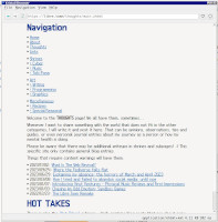
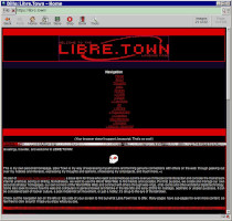
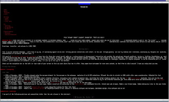
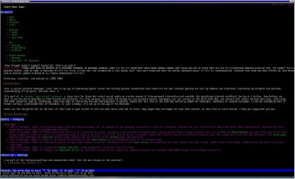
These are some screenshots I took at the time of writing; pictures of Libre Town as displayed in different obscure, old or small-size browsers! If you have your own pictures to contribute, feel free to e-mail me: LibreTown@proton.me.
Keep in mind that I deliberately used browsers here that are either super old, indie, or known to have severe incompatibilities with modern HTML, high resolution displays, or especially modern CSS. Libre Town looks terrible on most of them; mostly because of these known issues that I have no influence over. The point is that despite those shortcomings, the content and functionality are still unobstructed, even if the design fails!
Click to view full-size images.
